Advanced calendar card for Home Assistant with Lovelace.
Work in progress. If you have any problems, please use v0.8.5
Calendar card with advanced settings. It loads calendar events from Home Assistant - Google calendar component.
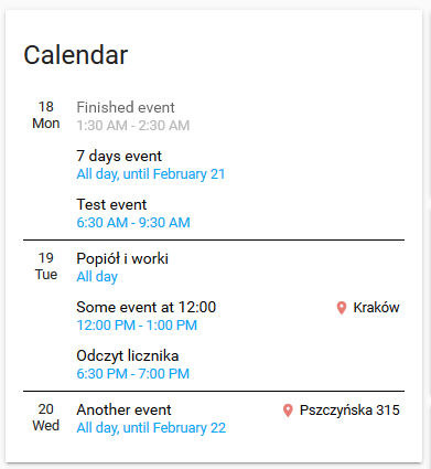
It contains two types of views: Events mode and Calendar mode. You can switch or select the default one.
The most important features:
- No need to load external libraries (everything is included)
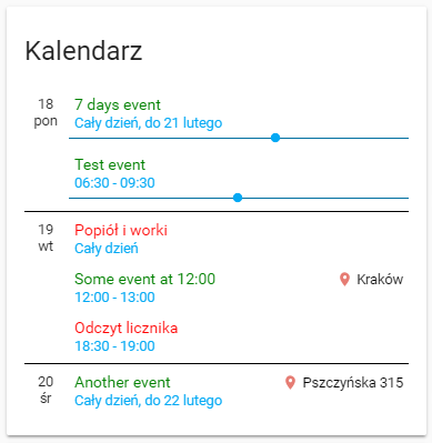
- Custom colors and settings for different calendars, custom font sizes, colors of every text and line
- All translations included, few of the words can be configured in settings
- Compatible with all day and multiple day events
- Fast switch between both modes, or make one of them default
- Event mode:
- Shows nearest events, one by one, day by day, time of events in a different way (dates, hours)
- Moves today's completed events up and dim them
- Highlights the next event, or show a progress bar
- Shows event location link
- Clicking on the title will open a new window with Google Calendar
- Clicking on Location will open a window with this location on Google Maps
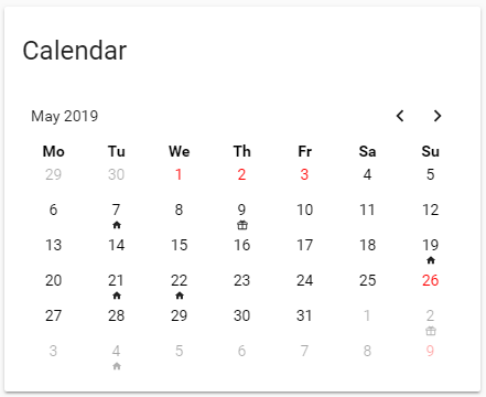
- Calendar mode:
- Show a traditional calendar (a table with 42 days) with configurable events icons like holiday, birthday
- Quick overview of the following months
- You can set keywords to show only important things, like birthday
If you have any suggestions about design or functionality, please let me know, open an issue or add a comment to .
- You need to have the
component configured in Home Assistant.
- Download
atomic-calendar.jsfile to/wwwdirectory in your Home Assistant - latest release - link not working (in development) - Add this reference to your
ui-lovelace.yamlfile:
resources:
  - url: /local/atomic_calendar.js
    type: module
- Add card with options to
ui-lovelace.yaml, examples below - If you are upgrading, try to reload your browser cache by pressing ctrl-shift-r or shift-F5.
- If you want to use
Calendar modefollow the guide in chapter 6, because HA is getting only 5 nearest events from Google Calendar.
| Name | Type | Default | Since | Description |
|---|---|---|---|---|
| type | string | required | v0.3.0 | custom:atomic-calendar |
| entities | list | required | v0.3.0 | One or more calendars, configured in HA Google Calendar component |
| title | string | optional | v0.3.0 | Calendar Calendar title |
| showColors | string | optional | v0.3.0 | true Show colors in events, configured in entities list |
| maxDaysToShow | integer | optional | v0.3.0 | 7 Maximum number of days to show |
| showLocation | boolean | optional | v0.3.0 | true Show location link (right side) |
| showMonth | boolean | optional | v0.3.0 | false Show month under day (left side) |
| showLoader | boolean | optional | v0.7.0 | true Show animation, when events are being loaded from Google Calendar. |
| showDate | boolean | optional | v0.7.2 | false Show the date on the right side of the title |
| startDaysAhead | integer | optional | v0.7.3 | 0 If you set more than 0, events will be loaded starting x days from today. For example 1 - the component will show events starting from tomorrow. |
| showDescription | boolean | optional | v0.8.4 | false Shows long description of event from Google Calendar. |
| showNoEventsForToday | boolean | optional | v0.8.6 | false Shows No events for today if no events, instead of omit the entry. |
Week / month names are translated automatically
| Name | Type | Default | Since | Description |
|---|---|---|---|---|
| language | string | optional | v0.8.4 | default Force language change. For example pt-br. If not set, default HA language is used. |
| untilText | string | optional | v0.3.0 | Until Custom translation of Until text |
| fullDayEventText | string | optional | v0.3.0 | All day Custom translation of All day text |
| noEventsForNextDaysText | string | optional | v0.8.6 | No events in the next days Custom translation of No events in the next days text |
| noEventsForTodayText | string | optional | v0.8.6 | No events for today Custom translation of No events for today text, only if showNoEventsForToday is true |
| dateFormat | string | optional | v0.7.2 | LL Custom date format - see https://devhints.io/moment for examples |
| hoursFormat | string | optional | v0.7.3 | default Custom hours format - you can set 12h or 24h or default (default for local HA language settings) or even provide your custom, like HH:mm or h:mm A - see https://devhints.io/moment for examples |
If you don't set colors, default theme colors will be used. If you use automatic night/day modes, don't use manual color settings.
| Name | Type | Since | Description |
|---|---|---|---|
| dateColor | string | v0.3.0 | default text color Color of date (left side) |
| dateSize | integer | v0.3.0 | 90 Date text size (percent of default font) |
| timeColor | string | v0.3.0 | default color Color of time (under the event title) |
| timeSize | integer | v0.3.0 | 90 Time text size (percent of default font) |
| titleColor | string | v0.3.0 | default text color Color of event title |
| titleSize | integer | v0.3.0 | 100 Event title text size (percent of default font) |
| locationLinkColor | string | v0.3.0 | default text color Color of location link (right side) |
| locationTextSize | integer | v0.3.0 | 90 Location text size (percent of default font) |
| locationIconColor | string | v0.3.0 | rgb(230, 124, 115) Color of location icon |
| dimFinishedEvents | boolean | v0.3.0 | true Apply filters to finished events (configured below) |
| finishedEventOpacity | float | v0.3.0 | 0.6 Opacity level of finished events |
| finishedEventOpacity | string | v0.3.0 | grayscale(100%) additional css filter to of finished events (default - greyscale) |
| dayWrapperLineColor | string | v0.3.0 | default text color Color of line - days separate |
| descColor | string | v0.8.4 | default text color Description of date (left side) |
| descSize | integer | v0.8.4 | 80 Description text size (percent of default font) |
| Name | Type | Since | Description |
|---|---|---|---|
| showCurrentEventLine | boolean | v0.3.0 | false Show line before next event. Don't enable when showProgressBar is true - will look bad |
| eventBarColor | string | v0.3.0 | default color Color of line showing next event |
| Name | Type | Since | Description |
|---|---|---|---|
| showProgressBar | boolean | optional | v0.5.5 |
| progressBarColor | string | v0.5.5 | default color Color of progress bar |
| Name | Type | Since | Description |
|---|---|---|---|
| type | string | optional | v0.5.5 |
| blacklist | string | v0.7.9 | null List of comma separated blacklisted keywords. Events containing any of them will not be shown. |
The second mode of view - calendar mode - is to show full month calendar with simple events icons or colors, for most important, infrequent events, like holiday or birthday. You can change mode by clicking "Calendar" title, or even make it default view. To make it working correctly you need to get more events than default 5 - you need to follow instruction in chapter 6 of this Readme, and setup it for 20-30 events at least.
There are four configurable possibilities for showing events occurring any day:
- day number color - for example "14" will be red for Valentine's Day
- Icon1 - will show any mdi icon under date, like birthday (default: gift icon)
- Icon2 - like above, just any other type of event (default: home icon)
- Icon3 - like above (default: star icon)
If you want to use any calendar's events, you have to add one or more of types:
            entities:
            - entity: calendar.calendar_holiday
              type: holiday			// events from this calendar will be red
            - entity: calendar.home_events
              type: icon2,icon3 // will show icon2 and icon3, but with filters configured below
            - entity: calendar.birthday
              type: icon1		 	// Icon1 has no filters, show all events from this calendar
	        - entity: calendar.atomic7777 // no type, it won't be shown in calendar mode
			CalEventIcon1Filter: bills,waste            // only events with those words will be shown
			CalEventIcon2Filter: cleaning            // only events with those words will be shown
If you set filters (keywords) for any type, it will show an icon only when event summary contains one of keywords. If you don't set any filter, it will show icons for all days with any events.
| Name | Type | Since | Description |
|---|---|---|---|
| enableModeChange | boolean | v0.7.0 | false Set true to enable mode change (Calendar/Events) |
| defaultMode | integer | v0.7.0 | 1 Set 1 to make Events default mode, set 2 to make Calendar mode default |
| firstDayOfWeek | integer | v0.7.0 | 1 First day of week, default 1 for Monday |
| CalEventHolidayColor | string | v0.7.0 | red Color of day for type: holiday calendar |
| CalEventIcon1 | string | v0.7.0 | mdi:gift Icon for type: icon1 calendar |
| CalEventIcon1Color | string | v0.7.0 | default Color of icon for type: icon1 calendar |
| CalEventIcon1Filter | string | v0.7.0 | null List of comma separated keywords |
| CalEventIcon2 | string | v0.7.0 | mdi:home Icon for type: icon2 calendar |
| CalEventIcon2Color | string | v0.7.0 | default Color of icon for type: icon2 calendar |
| CalEventIcon2Filter | string | v0.7.0 | null List of comma separated keywords |
| CalEventIcon3 | string | v0.7.0 | mdi:star Icon for type: icon3 calendar |
| CalEventIcon3Color | string | v0.7.0 | default Color of icon for type: icon3 calendar |
| CalEventIcon3Filter | string | v0.7.0 | null List of comma separated keywords |
| showLastCalendarWeek | boolean | v0.7.5 | true If true (default) it will always show 6 lines. If false, the 6th line won't be displayed if not needed. |
Simple configuration:
          - type: "custom:atomic-calendar"
            title: "Calendar"
            entities:
            - entity: calendar.kalendarz_dom
              color: red
            - calendar.atomic7777
	      blacklist: 'word1, word2'
Advanced config with all options, colors changed and progress bar enabled:
          - type: "custom:atomic-calendar"
            title: "Calendar"
            entities:
            - entity: calendar.YOUR_CALENDARS_HERE
            fullDayEventText: 'All day'
            untilText: 'Until'
            showColors: true
            maxDaysToShow: 7
            showLocation: true
            showMonth: false
            showCurrentEventLine: false
            dateColor: black
            dateSize: 90
            timeColor: blue
            timeSize: 90
            titleColor: black
            titleSize: 100
            locationIconColor: 'rgb(230, 124, 115)'
            locationLinkColor: black
            locationTextSize: 90
            dimFinishedEvents: true
            finishedEventOpacity: 0.6
            finishedEventFilter: 'grayscale(100%)'
            dayWrapperLineColor: black
            eventBarColor: blue
            showProgressBar: true
            progressBarColor: blue
Simple configuration, both Events mode and Calendar mode, calendar is default:
          - type: "custom:atomic-calendar"
            title: "Calendar"
			enableModeChange: true
            defaultMode: 2
			CalEventIcon1Filter: birthday
			CalEventIcon2Filter: waste,bills
            entities:
            - entity: calendar.kalendarz_dom
			  type: icon2
            - calendar.atomic7777
			  type: icon1,icon2
            - entity: calendar.kalendarz_swieta
              type: holiday
You have to add max_tesults setting to google_calendars.yaml file:
- cal_id: [email protected]
  entities:
  - device_id: calendar_id
    name: Calendar_name
    max_results: 15
Automatic update using HACS component:
- You need HACS installed and configured
- Go to Community tab, Settings
- Paste this line into
Add custom repositoryfield:
https://github.com/atomic7777/atomic_calendar
- Choose type: Plugin
- The atomic_calendar component will be installed and updated.
- Add to the
ui-lovelace.yamlfile :
resources:
   - url: /community_plugin/atomic_calendar/atomic_calendar.js
     type: module


